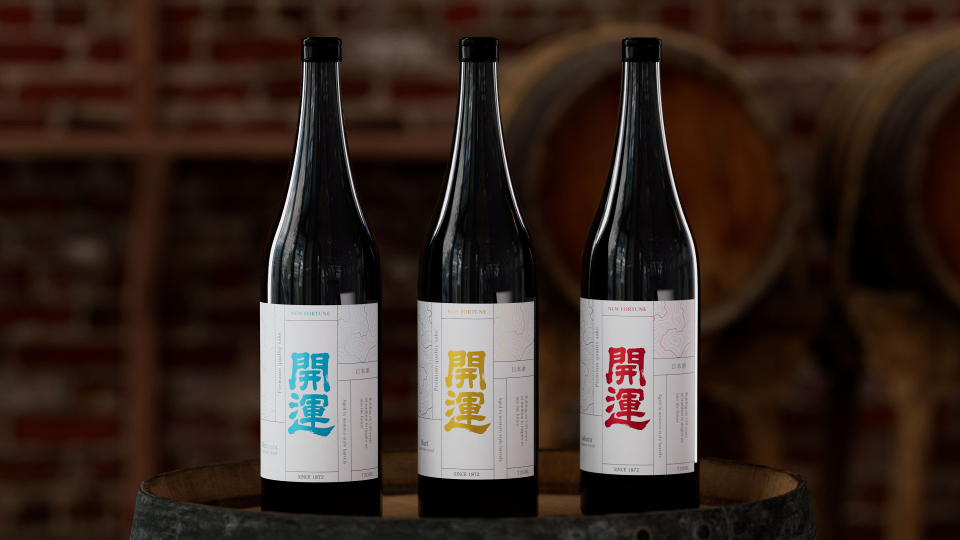
This project explores the creation of a sake packaging design that merges a sense of luxury with refined Japanese aesthetics. The concept is developed across three distinct color variations, designed to resonate with a global audience while maintaining a strong cultural identity.
Kaiun
Alcohol
Packaging
1 weeks
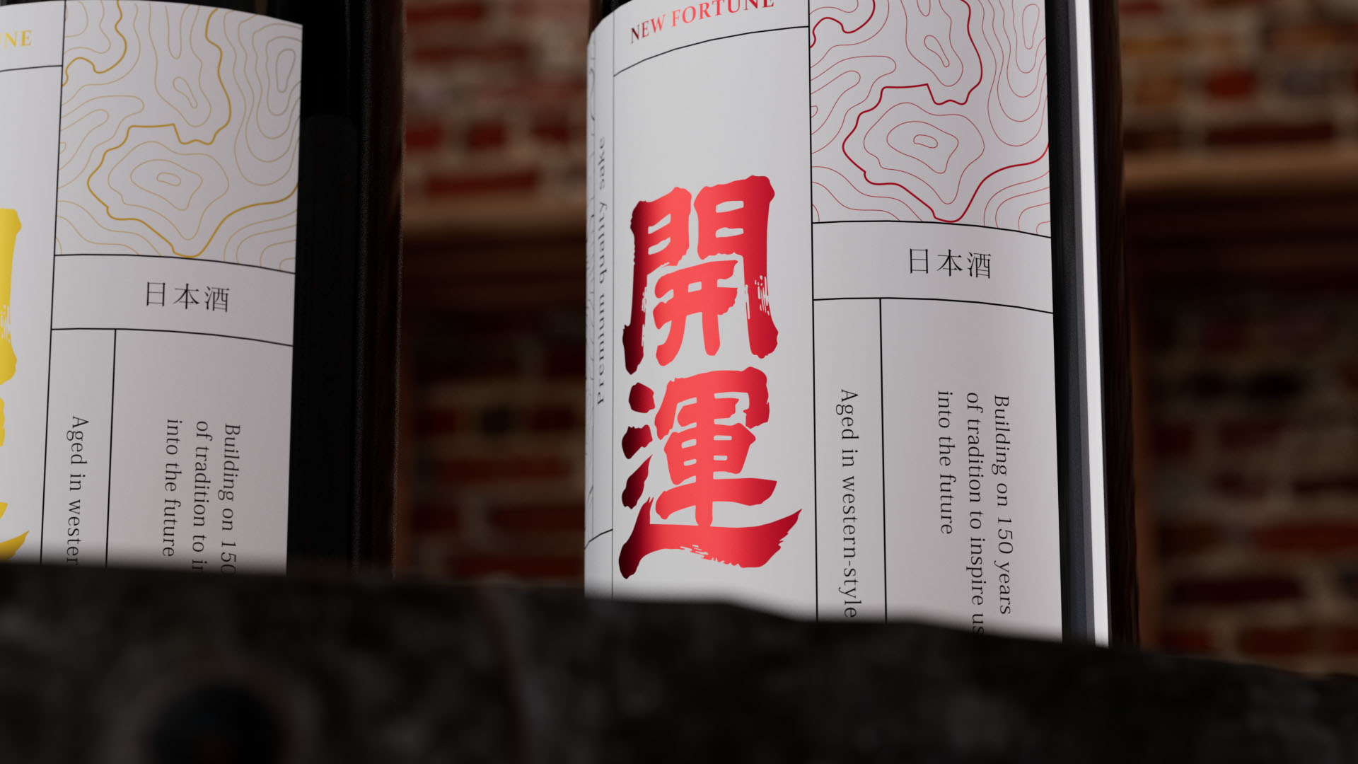
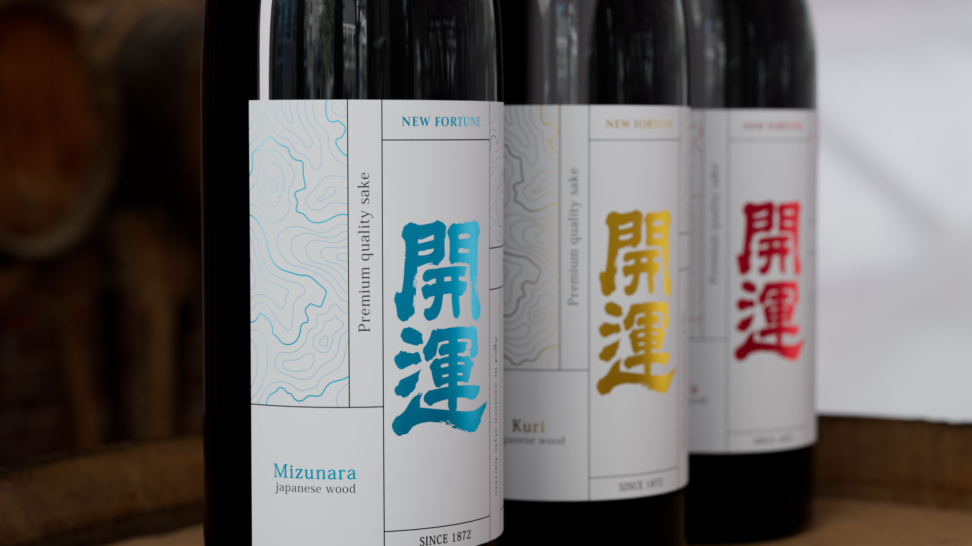
The overall layout is structured using a grid system, ensuring clarity, balance, and optimal readability. Fine linear patterns inspired by natural wood grain are subtly integrated, creating a cohesive dialogue between the graphic elements and the materials they reference.
The logo, “Good Fortune,” the title, “New Fortune,” along with the graphic motifs and the names of the selected wood essences, are enhanced through carefully chosen vibrant accents. Each bottle variation is clearly differentiated, emphasizing the unique qualities and character of each type of wood.
This design aims to balance innovation with a strong perception of quality and craftsmanship. The intention is to create a distinctive visual identity that captures attention and leaves a lasting impression on consumers.
Previous project
Next project